OPENING THE EDITOR
To navigate to the clevr Editor, select the form you would like to edit from the Homescreen and click on any student’s record. Once the record is open, click on the pencil icon in the top left corner. This pencil icon will only be visible if your role has Editor access to the form.
Clicking the edit pencil icon will load a copy of the form into the Staging Area. After the form has been loading into the staging area the clevr editor will appear.
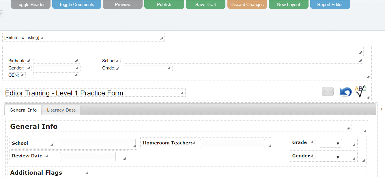
EDITOR SECTIONS
TOP MENU
TOGGLE HEADER
The Header image in the Editor is a placeholder to let the user know where the header will appear in the live form view. Click on the Toggle Header option to show/hide the placeholder within the Editor.
TOGGLE COMMENTS
Toggling this option will add a comments section to the Options Accordion. Comments left within the staging database are not only viewable with the Editor open, not the live view.
PREVIEW
The Preview function allows users to preview the form changes, without affecting the live environment.
PUBLISH
The publish function moves all changes from the staging area to the live environment.
SAVE DRAFT
Save to Draft will save all form changes to the staging area without affecting the live environment. This allows Form Developers to save a copy of their work and return to it at a later time.
DISCARD CHANGES
Discard changes will remove all changes for the form from the staging area and return the Form Developer to the live environment. All unpublished changes to the current form will be permanently removed.
NEW LAYOUT
The New Layout button will create a new blank layout for you to work with.
REPORT EDITOR
This option will only be viewable if your role has the Report Editor enabled. Click this button to load the Report Editor where printouts are edited and maintained.
PAGE PROPERTIES
Page properties can be found in the upper left side of the editor window – look for the small “P” icon. It is really small and easy to miss.
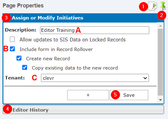
The Page properties window has five different sections.
-
Copy Page – The Copy Page button is the first button on the right side of the Page Properties window. Clicking this button will create a copy of the current form and will allow you to choose which HTML reports to copy. All fields flagged for search, SIS, bulk data entry, etc will automatically be updated to the new Form ID number.
-
Pin/Unpin Window – The green push pin is used to pin the window open or automatically close it when the mouse if moved away. To close it after the first time opening it, you will have to click the pin to toggle it to automatically close.
-
Assign or Modify Initiatives
-
Description – This is where you change the name of the form. The form title label and form name on the Homescreen will be automatically updated with the value within this field.
-
Record Rollover – These settings control which options are present within the Record Rollover module for the form specified
-
Include form in Record Rollover – This flags the form to appear within the new Record Rollover module and will lock the most recent record if a rollover is performed with no other options selected.
-
Create New Record – This will create a blank new record in addition to locking the previous record.
-
Copy Data to the New Record – This will make a clone of the most recent record in addition to locking the previous record. Select this option if you do not want the new record to be blank!
-
-
Tenant – Users with access to multiple tenants can select which tenant to move the form to.
-
-
Editor History – Editor History displays the forms that have been edited with the current login.
-
Save – Hit the Save button to save the changes you’ve made within Page Properties.
OPTIONS ACCORDION
The Options Accordion accordion is what you will work from 99% of the time that you are within the Editor. With it you can add, edit, delete, and move elements around in the form.
To open the Options Accordion, you will first need to click on an element on the screen. The information and values displayed in the Options Accordion are related to only the selected element. The element highlighted in blue is the currently selected element.

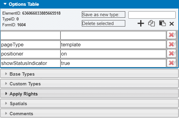
OPTIONS TABLE
Many functions are present within the Options Table section of the Options Accordion.
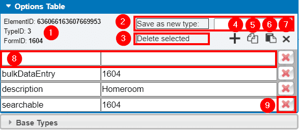
-
ID Numbers – Double click any of the ID numbers within this section to copy it to your computer’s clipboard.
-
Element ID – The ID number of the element selected. Element ID numbers are unique and sequentially generated. The element ID number is really important and drives:
-
Data saved to the database
-
Functions such as javascript, show/hide, shadowID, etc
-
Is how the printout is connected to the form field
-
-
Type ID – This ID number is not as important as Element & Form ID. This is the ID number of the base or custom type selected. All types have the same Type ID number – for example all containers have type ID 97, all tabs are type ID 81.
-
Form ID – This ID number is used when flagging other fields for modules such as SIS, Import Data, Advanced Search, Bulk Data Entry, etc.
-
-
Save a Custom Type – If you have a section that will be common to multiple forms, you can save a Custom Type which will appear within the Custom Types section of the Options Accordion. Name your Custom Type by entering a value on the right. Please note that any attributes saved on a Custom Type (ex: searchable, SIS, queries, etc) will not be editable within the saved Custom Type. For this reason, we recommend that any elements within Custom Types you are planning on saving do not have any attributes.
-
Delete Selected Element – This will delete the element you have selected. You should only use this option to remove elements on forms not yet in production. Deleting elements can lead to data loss, please review our detailed Deleting section on the “How Do I” page before attempting to delete anything.
-
Add Attribute Row – Press this button when you need to add a new attribute row. It will cause a blank attribute line to appear. See #8 in the screenshot above for a visual of what a new attribute row looks like.
-
Copy Element – Click this button to copy the element you have selected to your computer’s clipboard.
-
Paste Element – Click this button to paste the element from your computer’s clipboard.
-
Close – Click this button to close the Options Accordion.
-
Add Attribute – Add an attribute to the selected element by typing the attribute on the left, then entering the value in the right field. The attribute field on the left has an auto-complete feature to avoid any errors. Hit enter to save your change, if this is overlooked and you select another element your changes will be lost.
-
Delete Attribute – Click this button to remove the selected attribute.
BASE TYPES
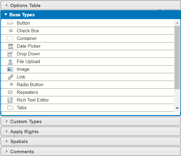
The next section in the accordion is called Base Types. A Base Type is the basic kind of element that can be added to a form. It includes things like text, Drop Down and tabs.
Details on setting up specific Base Types will be covered in the relevant sections of the How Do I page.
CUSTOM TYPES
The next section within the Options Accordion is Custom Types. Custom Types are commonly used groupings of Base Types that clevr has created to save time so that Form Developers do not need to manually create everything when developing. Some Custom Types have been styled, and some are elements that are not included in the base types section of the Accordion.
Details on setting up specific Custom Types will be covered in the relevant sections of the How Do I page.

APPLY RIGHTS
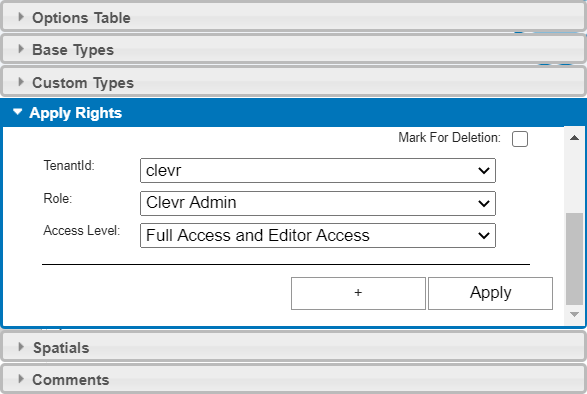
The Apply Rights section of the Accordion is where you can view and apply specialized rights for the element selected. Child elements take the rights of their parent element unless otherwise indicated. The parent container of a tab is the 97 container (not the 81), the parent container of the form is the 0. Access rights are quite complicated and have many layers. Please see the Specialized Access Rights section on this page for more details.
SPARTIALS
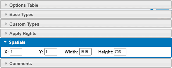
In the Spatials section of the Accordion you are able to view and change the X and Y coordinates of the selected element as well as view and change the height and width of the element. The X and Y axis spatials of the element selected are relative to it’s positioning within the parent container. Save the new Spatials by hitting enter on your keyboard.
COMMENTS
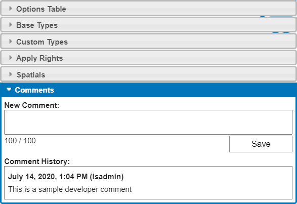
Form Developers can leave comments on an element that is only viewable within the Editor view. You need to select the “Toggle Comments” button within the top Editor menu for this option to be available within the Accordion.

Click on an element then select the Comments section of the Accordion to enter a note. Once a comment has been entered it can not be removed unless the element it’s associated with is removed. Up to 100 characters can be used within a comment. When a comment has been left, you will be able to see the contents, date and time it was made, and the username of the person who authored it.
Elements with associated comments have a blue icon on the right side:
MOVING ELEMENTS
MOVE WITH ARROWS
To move elements around in the editor using the arrow keys on the keyboard, you first need to select the element that you wish to move. The element highlighted in blue is the currently selected element.

You can use the up, down, left, and right arrow keys to move elements around in their current container. If you attempt to move the element outside of it’s parent container using the arrows keys, you will receive a warning message. Elements left outside of their parent containers may not be editable within the live view of the form.
MOVE WITH MOUSE
Clicking and dragging is the only movement method that can be used to move items outside their parent containers.
First you will click and hold the item you want to move and then drag to a new location.
You will want to make sure that when you are clicking and holding the element that you are inside the selected element or you will resize instead of move.
SPATIALS
The third way to move elements around in the clevr Editor is to use the Spatials section within the Options Accordion.
The first step is to select the element that you wish to adjust and then click on the Spatials section in the Options Accordion to open it. You can enter in the X and Y coordinates of the element as well as entering in values for the height and width. The X and Y axis spatials of the element selected are relative to it’s positioning within the parent container. The values that are entered are in pixels.
You save the value you have entered by clicking the enter key on the keyboard.
MOVE MULTIPLE ELEMENTS
clevr supports multi-element drag and drop! When moving multiple elements, you can only use your mouse or the arrow keys.
Select the first element you’d like to reposition, then hit the CTRL button on your keyboard. You can then click on another element that you’d like to reposition. If you’ve followed the correct sequence, the perimeter of the second element will turn blue to indicate that it is also selected:

BASE AND CUSTOM TYPE “HOW TO”s
ADDING BASE AND CUSTOM TYPES TO YOUR FORM
New Base and Custom Types can be added to your form using a few different methods.
METHOD 1
First select the container you want to add the new element to. Next select the element you’d like to add from the Options Accordion. Double click it to add it to the currently selected container. This will add the new element to the top left corner of the container. From here you can move the element into position using one of the move methods shown in the Moving Elements section below.
METHOD 2
This placement method is the one our team recommends, it gives you the greatest level of control over where the element is placed.
The other way elements can be placed is by clicking on the element within the Options Accordion and dragging it into position. The container where you are placing the new element does not need to be the selected container, but you should ensure the entirety of the new element is contained within the container you’re added it to before dropping it into position.
From here you can move the element into position using one of the move methods shown in the Moving Elements section below.
Adding Attributes to Form Elements
Attributes can be added to elements to flag them for modules within clevr or do add functionality to them. Attributes can be applied to from the Options Table of the Options Accordion. Previously added attributes will be viewable when you click on any element:
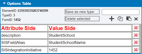
Each attribute has two requirements – the attribute itself which is added on the left, then the value which is added on the right. The attribute side on the left contains auto-populating functionality to help reduce errors – many attributes are case sensitive. Applying specific attributes will be covered in detail in the relevant sections of the “How Do I” page.
NEED HELP SETTING UP A SPECIFIC FUNTION? CLICK HERE!
